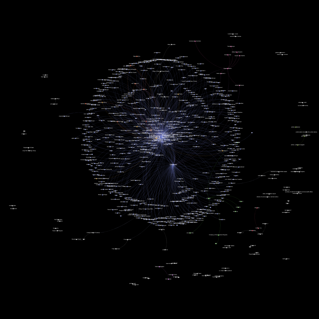
Back in March, Wikileaks released over 30,000 emails “sent to and from Hillary Clinton’s private email server while she was Secretary of State”.
I decided to make a quick map showing how emails were sent through the server, mapping the senders and recipients. This post is a quick explanation of how I did it.
First, I needed the emails. I didn’t see an official bulk download from Wikileaks, and I didn’t need all the data anyway - just the sender and recipient. It turned out to be another job for Python, some good whiskey, and BeautifulSoup.
I iterated through each page of search result data (searching for anything in the “All” date range) at 200 results per page. Then, I used BeautifulSoup to parse out each record.
After I had the data, I put it into a weighted directed graph using networkx. This also let me dump the results into gexf format - the native format for use with Gephi.
Finally, I used Gephi to make the data pretty. I just applied a ForceAtlas layout, adjusted the size of the nodes by degree, and ran the automatic community detection to color each node.
Here’s the final result (click for higher res)!
You can find all the code and raw data files here.
-Jordan (@jw_sec)
